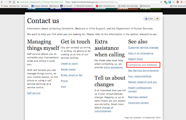
So I was trying, attempting, and endeavouring to navigate the Department of Human Services website, and it makes me want to hURL. I need to apply for a Medicare card, since I'm a big boy now, and 25 is the age the government considers me a true adult. I CAN still LIVE with the parents and can't afford a house in the current climate, but I'm considered truly independent (I rent outside of home).
I don't want to turn into the person that writes letters to companies and governments, but I am so angry, and if I didn't do this, I would be seething when I log on tomorrow and give it another crack.
So, here's what I sent them:
1) Control+F, then typed 'contact'. Clicked 'Contact Us'
2) Looked at four seemingly random, scattered columns of text and hyperlinks that really make no sense in terms of layout. Finally found 'Complains and feedback' after Control+F and typing 'feedback'
3) Scrolled down half the page to find the 'Online' heading, then clicked the hyperlink. Ironically, this says: 'It’s fast and easy to submit feedback online. You can submit your feedback using your Centrelink, Medicare and Child Support online accounts through myGov. You can also track the progress of your submission, and we can respond more directly.'
4) Scrolled down 2/3 of the page, and scanned all the headings for 30 seconds or so until I found the 'If you do not have a ____ online account online form' subheading, which I clicked. Initially I was confused, since I wasn't giving feedback/complaint for centrelink, medicare or child support, I didn't know where to look. This layout is toxic, and it permeates your site.
5) Got to the 'Your details' page of the feedback form, clicked Complaint! The page then refreshed...why would you do that? I then clicked 'Next' (Why is this not a drop down menu on the same page as the comments and personal details page?)
6) It then asked for my details. In fact, I tried to give my details, but then it asked for a customer ID. How do I know what my customer ID is? How do I find out? Well your website is too fucking difficult to navigate, so I can't find out. Instead I am submitting this 'anonymously', because it is the path of least resistance. For the record, my name is Ben Vezina, and my email is xxxxxxxxx, and I want a response from you guys. My myGov account is xxxxxxxx. I clicked 'Customer', the page then refreshes...again, why? I then clicked 'anonymous', then 'Next'
7) Feedback details form, ahh finally, the one I've been looking for. After 7 significant page changes, I'm finally here. I seriously almost quit at step 4, although it's a good way to not receive any feedback..you know, by making the form hard to find. I am angry at this point, and I feel like spraypainting penises all over your website.
What's worse, is when I am using the drop-down menus, on this page the 'digital service', 'system not user friendly' and 'online services' are all options! So you people already know this is an issue, yet you refuse to simplify it! That is ridiculous. The internet is suppose to make things easier, not harder.
I also noticed the feedback forms are identical between the Medicare/Child support and Centrelink. Why not have them all link to the same page, and have a dropdown menu, including an 'OTHER' option, where users can put their own in? Why make this a tedious experience?
Instead of all this, you guys should have a one click button that goes straight to the feedback form, which then has several drop down buttons, so you can pre-sort feedback. This form can have personal details, such as name, email, myGov account etc.
You people need a minimalist approach to web design, because otherwise people get lost in your web. Then I assume you receive phone calls from people who don't understand how to get to certain links. The idea of a website is that it automates the job and flow of information, not locks it away in a labyrinth.By the way, this is just one aspect of your crappy website I have talked about."
The amount of time I've wasted on this already, god damn. I know I use 'you people' a lot, but I find it really hard to consider 'them' human in my current state of rage. So I found the form, in case any of you people are wondering where it is: https://www.humanservices.gov.au/sites/default/files/documents/3101-1306en.pdf
Ooops, no it's not. That form is for other people, not me. Back down the rabbit hole we go.
Went through myGov, put in my existing (parents) Medicare details, recieved this message:
"Sorry, we are unable to verify your identity with Medicare using the details you provided. Please contact Medicare for assistance."
After spending another 15 minutes navigating the website, clicking every link I thought would possibly contain what I need, a quick Google search and clicked the third link:
Except oh wait, this is transfer to an NEW EXISTING card. See, their definition of 'new' is different from mine. They say 'new' as in 'new to me', not 'newly created'. Which means I can't transfer myself to a new not-yet-existent Medicare card. Great. I think I'll just waste an hour on the phone talking to them tomorrow.
So, suuper productive evening all up, cheers cunts.


No comments:
Post a Comment